

It’s possibly the new Symbian UI complete with new homescreen and it’s implied to be coming to Symbian^3 devices. The space eating battery, signal, time and operator area has been reduced to a small bar. The widget spaces aren’t confined to their small rectangular enclosure and we have a host of three buttons, call (something else) and what looks to be options.
Investments in Symbian:
- Completely new devices
- Improvements in hardware performance
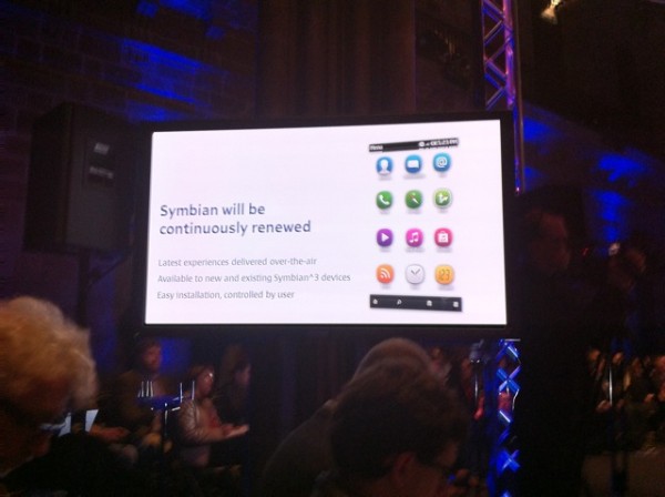
- Latest experiences delivered over the air
- Ongoing Qt Development
- Easy Installation, controlled by the user
Jo Harlow and sneak peek. Where was this btw?From MWC. There’s four buttons at the bottom here. Same info bar at the top.

Update: Here’s another useful slide: Check out flexible widgets and thin pull down status bar. Though you could say that’s very Android like, Maemo has had similar drop down status bars since 770. Either way, it’s very, very good. Cheers Goc, Aikon171, suresh and others for sending this in too.


